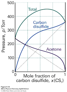
Or, it contains "artist renditions" of data. Below is an example from Atkins' Physical Chemistry.
The best texts show actual data. Two of my favourite texts are: Biological Physics by Phil Nelson and An Introduction to Thermal Physics by Daniel Schroeder.
It is also interesting and disturbing that looking through the Australian edition of a popular introductory microeconomics text co-authored by Robert E. Frank [of Economic Naturalist fame] I could only find schematic graphs and no actual data.
Why does this matter?
After all, the figures look so much nicer and cleaner if they are just schematic. It is easier for students to understand them.
However, I think it is very important that students learn:
- Real science is messy.
- A theory is only as good as the experimental evidence for it.
- How to read, understand, and critique experimental data.


On an unrelated note, why do some authors seem to think that filling up a graph with gridlines makes it clearer?
ReplyDelete"Physical Biology of the Cell" not only has data in figures, but includes data from illustrative experiments online, so that exercises may be designed around them.
ReplyDeleteOne more reason not to use Atkins' book. There are other examples in this book as well. I think it's insulting to not use real data when ever possible. It's even more insulting pass off computer generated data as real experimental data...especially it's not that hard to get the real thing.
ReplyDeleteThe grid-lines in the Kittel figure are actually useful since one may actually want to read off the susceptiblity vs. T for a given element from the data presented. That figure was published in the days before ""DataThief" and electronic media.